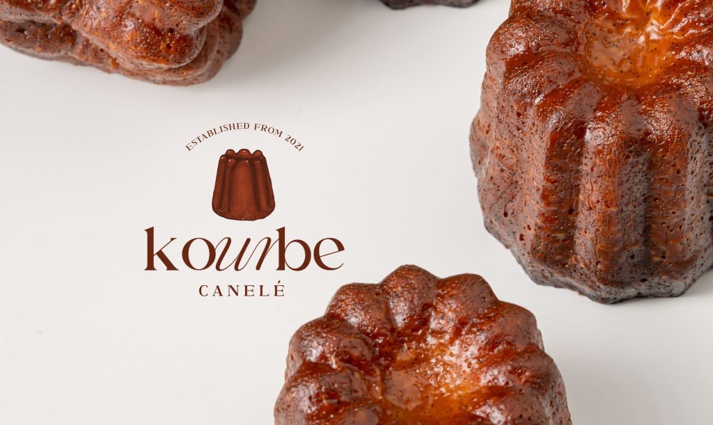
KOURBE CANELÉ

The Logo Design
The use of hand-drawn canelé illustrations paired with French-inspired typography allows the logo to evoke a stronger connection to the dessert’s origins in France. This thoughtful combination not only enhances the cultural narrative behind the brand but also adds a touch of sophistication. The clean, minimalist layout emphasizes clarity and elegance, while allowing the handcrafted canelé elements to stand out—bringing warmth, identity, and visual balance to the entire composition.


Brand Stationary Concept Design
Each design embraces a minimalist approach that brings the hand-drawn aesthetic to the forefront. The use of raw, natural materials further reflects the founder’s humble, grounded, and quietly generous character—allowing the brand’s sincerity and simplicity to shine through.

Packaging Concept Mockup Presentation